Fragile.
|
Exhibition Text
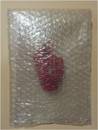
Finally, my last piece of this journey through the art program happens to be a favorite. The inspiration from this piece realistically came from a sticker that I saw on a box that said "Fragile handle with care". It was that that triggered the inspiration for this piece the most. Besides that symbolism place a huge part here too. I had a small idea that had nothing to do with the outcome for this piece but while trying to completely the original idea this came to be and I believe it is better and I am definitely proud of this. Inspiration My inspiration for this piece, as stated previously, actually came from a sticker on a box which stated "Fragile handle with care". The reason for mentioning this is because I believe the inspiration is extremely organic and it is genuine. Besides the sticker, symbolism plays a big part here. The heart is obvious but the bubble wrap used symbolizes protection and how the heart needs to be cared for and treated gently. The heart is also in a sort of bubble wrap bag to symbolize suffocation of ones feelings. 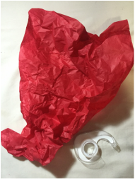
|
Process
The process of making this piece was quite simple. Red tissue paper was taken and carefully molded into the best possible human heart without using anything to keep it together to give off a more organic feel to it. Once the main shape was created the connected nerves that come from the top of the heart were also careful molded. After having the desired shape bubble wrap was taken and it was placed in side as centered as possible. Small pieces of tape were put so that the heart didn't move around and after the bubble wrap was sealed at the bottom. |
Main Concern.
|
Exhibition Text
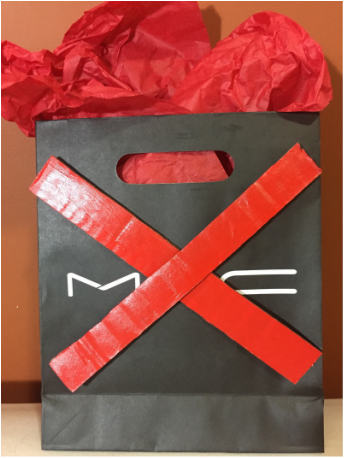
This piece, to me, falls at the very bottom of my favorite pieces this year. My inspiration here came from Barbara Kruger. I decided to make a piece inspired by her, again, to see what different take I had on it a year from the last time. It was an enjoyable work to create but the outcome wasn't completely as expected. Looking at the finished product I believe this could have been done way better and the concept could even be done in a completely different way. Because of how I feel about the outcome, I take it as a learning experience and as always a reference to improve from very soon. Inspiration My inspiration for this piece was Barbara Kruger. Previously, last year, a piece was already made inspired by her so what I intended to do here was to revisit that idea and get inspired, again to be able to see what kind of new take i had on the inspiration depending on how much I've grown. The inspiration came from her use of captioning and her use of words in an art piece. Here, I used the same brand name but manipulated it to have my own take of it and had it stand for 'Main Concern' which is what the idea of the piece is all about.   |
Process
The process of this piece wasn't very complex. A shopping bag from MAC cosmetics was taken and filled with foam balls to keep up its posture. The bag was then topped off with red tissue paper to give it more of a shopping bag feel. After, Pieces of cardboard were cut into two and they were both painted red using acrylic paint. Once dries, the two strips of cardboard were placed over the brand name of the bag completely covering the A and leaving the M and C which are the initials of the title to this piece, Main Concern. The pieces were taped and the product was completed. |
Goodbye.
|
Exhibition Text
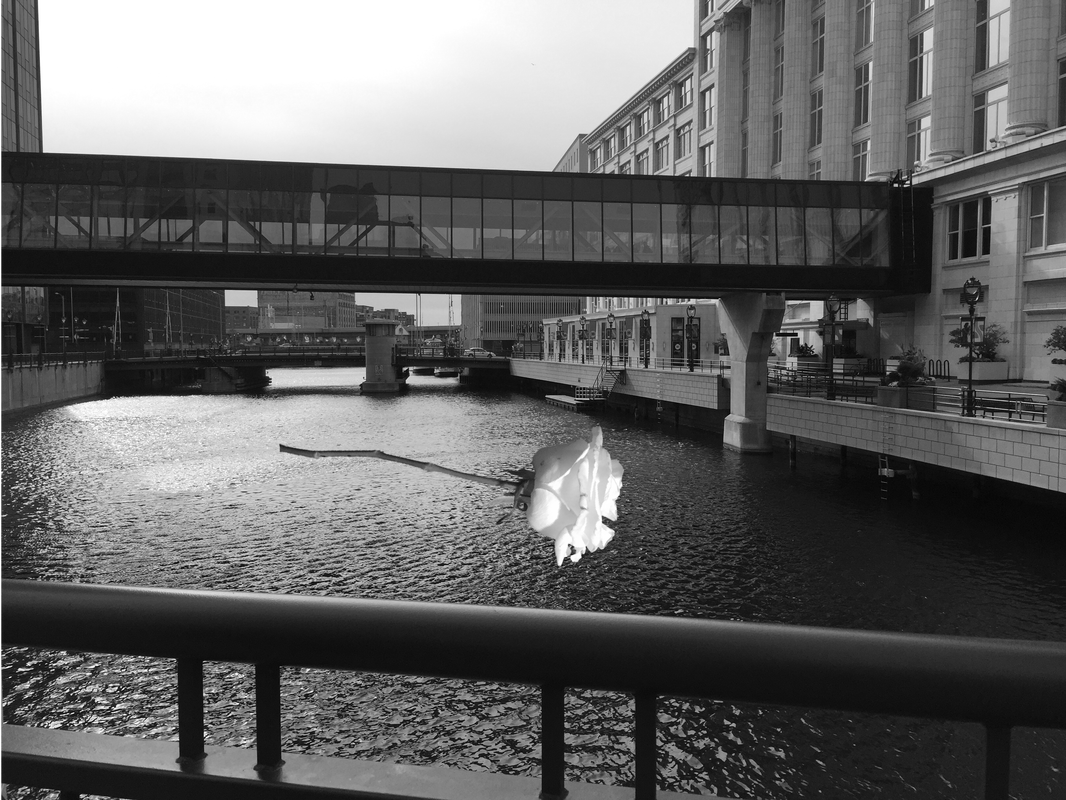
This is yet another one of my favorite pieces also because it is very personal to me. It was also one of the pieces that was most fun to make. Personally I really enjoy photoshop and to be able to combine that with photography was very enjoyable. Now, the rose was an actual rose that was given to me which is what gives this entire piece so much meaning. There's real history and meaning behind that rose that the rest of the piece only enhances the feeling. The color choice also really helps portray the mood I try to get across through this piece. There such a story behind this piece that I adore it and it has become one of the pieces I am most proud of. Inspiration Symbolism was the main inspiration for this piece. This was due to the meaning that the image already carried for me. The rose itself stand for something beautiful in my case a relationship. The act of putting it over the Milwaukee River was the symbol of drowning it, the idea of it. Typically water is good for a flower, it's what keeps it growing along with sunlight. Now, when the sunlight is gone like the color was changed to black and white here, and when there is too much water, the rose will die. The rose symbolizes the relationship I was in and the water stands for all the unfortunate occurrences of it that became too much .   |
Process
To begin this piece was the idea and the rose that was used here was sitting in my room and as about to throw it away I decided to get rid of it a different way and that was through this piece. The image of the Milwaukee River was taken downtown while on one of the roads that crosses over it. After, several images of the rose were taken. Using photoshop, The chosen image of the rose was uploaded and using smart selection I cut out all of the rose eliminating the entire background and part of the stem to make it shorter. The leaves were also eliminated to give more of a feeling of it dying out. The background image was then uploaded and the rose was copied and pasted into the background. After, the photo was flipped and adjusted to the correct sizing to fit to my liking on the background. The two were then combined to create one image and after that the colors were changed to create the entire piece black and white. |
The Fall.
|
Exhibition Text
This is yet another one of my favorite pieces also because it is very personal to me. It was also one of the pieces that was most fun to make. Personally I really enjoy photoshop and to be able to combine that with photography was very enjoyable. Now, the rose was an actual rose that was given to me which is what gives this entire piece so much meaning. There's real history and meaning behind that rose that the rest of the piece only enhances the feeling. The color choice also really helps portray the mood I try to get across through this piece. There such a story behind this piece that I adore it and it has become one of the pieces I am most proud of. Inspiration The inspiration behind this piece was the baroque period in art history as well as the Mexican culture which means a lot to me considering that it is my background. The background in this piece is pitch black connecting to the baroque period. The lighting was also very much used throughout the process of photographing the pieces. I really intended to show my Mexican culture that I am so proud of through this piece. The items used here are handcrafted tiny cups made out of clay that were sent to me from my family in Mexico when I was a little girl. In Mexico many of these are used. Many of the household items in a typical Mexican home are just like these in a larger version that are actually able to be used but when there are younger children around a small version of them are made so that the kids are allowed to play with them. These tea cups were and still are a big part of my life. These are what I personally played tea party with throughout my childhood and that means a lot to me. |
Process
Many of these teacups laid throughout my house varying between my sister my own and even some that belonged to my mother. These items already meant so much to me. Upon photographing them, I began by spreading them out on a black cloth and using a light i lit them from one side so that there were heavy shadows were created. While doing it is when the idea of them tumbling down occurred and about 50 photos and three of those spoke to me. |
Female Pain.
|
Exhibition Text
At this point in my art I have been very experienced with acrylic on canvas. Many previous pieces have also been completed this way. This piece was a bit different with the technique used to achieve the outcome. This piece came from the inspiration of feminism. The finished product was not what I originally expected. A better job could have been done and errors could have been corrected but I decided to leave it as so to be able to reflect on it and have something to improve on in the near future. Inspiration Inspiration for this pieces came from both Caravaggio and Feminism. Caravaggio was known for his baroque style paintings. The paintings were usually extremely dramatic filled with really intense contrast between the dark shadows and the bright highlights. This is what was intended to imitate in my piece. A light was intended to be showed coming from the top right corner illuminating and hitting everything from that side. The color choice also came in to favor the baroque style. Using black and white really intensifies the lights and darks in a piece. The choice of adding the little bit of color was meant for the same effect. Using the color red especially on a piece with no color is really dramatic. The entire idea of what was painted came from feminism. Personally, I believe that regardless of gender everyone should be treated equally in every aspect, it being socially and economically. Now although years have passed and things have changed over time, I do not feel like both genders are completely equal yet. There may be a smaller gap but there is still one. And for that, I decided to create a piece that shows that it's still painful to be a woman in a world that doesn't treat us like men are treated.   |
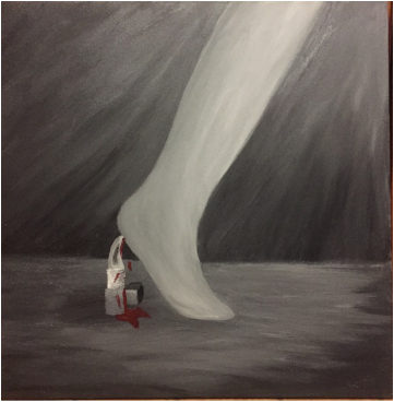
Process
The process of this piece was quite simple considering the fact that it was something that I have done before. Upon beginning this piece the foot and leg itself were sketched and so was the bladed lipstick. After both were sketched out and polished to my liking the images were combined to create the entire picture. As soon as having the final product drawn. The making of the canvas started. As soon as the canvas was done it was completely covered in gesso as the base for the acrylic paint to prevent cracking. Once dried, the painting began. Long and large strokes were used with about 7 different shades of color that ranged from pure black to pure white all in the grey tones. Besides those colors a dark red was also created using red black and brown for the blood. For the leg and the foot the pure white and the 2 lightest shades of grey were used with long strokes of color hat were all manipulated while wet to create a smoother blending and transition between the colors. The same was done for the entire background except that the background used about 3 different shades of grey again using the same technique used in the leg. The lipstick/knife used the purest white along with pure black and two shades of grey to complete. After, the shadow of the foot on the floor was created by just toping the already painted floor with a darker color. |
Summer Project
|
Exhibition Text
This piece was one of my most simple ones. It became more of a learning and experimenting pieces for me. Sketching still lives helped me with distinguishing the lights and the darks on an object. Overall I believe I did a decent job on the sketches. This is my least favorite piece due to the fact that personally, I am not very good at drawing especially not realistic objects. I believe with more practice and many more of these sketches will help me improve my skills with drawing and I see this as the beginning of that. 
|
|
Process
For this piece all that was taken was sketch paper and a couple of found object. I chose to do object lying around my bedroom to attempt to sketch more realistic things that people don't usually draw but that we see on a daily basis. Also, what was done was that I didn't move the objects so if half of it was covered I did not move it to reveal the entire thing. This was to capture it in its moment to capture the realism in it. If each object were to be taken and placed in a certain way it would take away how it is used in a regular day. I generally used object that looked like the image above. Lighting was also untouched for the same reasons.
For this piece all that was taken was sketch paper and a couple of found object. I chose to do object lying around my bedroom to attempt to sketch more realistic things that people don't usually draw but that we see on a daily basis. Also, what was done was that I didn't move the objects so if half of it was covered I did not move it to reveal the entire thing. This was to capture it in its moment to capture the realism in it. If each object were to be taken and placed in a certain way it would take away how it is used in a regular day. I generally used object that looked like the image above. Lighting was also untouched for the same reasons.
